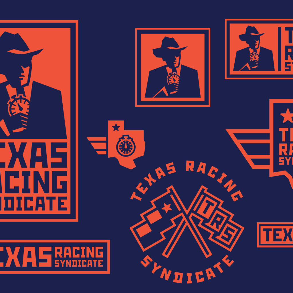
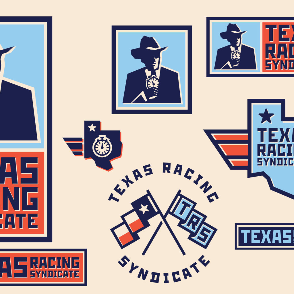
Responsive logo design: a necessity, not a luxury

I recently designed a logo style guide for my buddy over at Texas Racing Syndicate. As part of my creative process, I researched current trends and came across the concept of responsive logos and branding. And when I talk about responsive logos, I’m not only talking about just resizing; it can go beyond that. The concept was not foreign to me, as responsive design is the way I’ve been looking at logo style guides for many years. Logos, like everything else, have had to adapt to the ever-changing high-tech world we live in.
Designing a responsive logo style guide allows you to add flexibility to limitations. I am a true believer in the fact that to create a consistent brand; the foundations have to be carried out through the whole identity package. Times are changing, and design methods are evolving as well. Nowadays, a brand’s visual identity, adaptability, and flexibility is a necessity, not a luxury!


Twenty years ago, the biggest challenge was to make a logo work on a fax machine. Now, think of all the ways that a logo has to work today. It needs to adapt and look good on all social media platforms, mobile devices, computer monitors, apps, physical products, and more!


The other thing I saw in responsive logo design is that it goes beyond fitting into different mediums, it allows logos to be more flexible in the ever-changing landscape of consumers and the amount of information around us. A responsive logo is not afraid to change or adapt and can help a brand stand out in a world saturated by media, as found by a recent study by UCLA.
In today’s market place, there’s so much information coming at us that a brand needs to be flexible to be memorable. Our brains crave new experiences, and responsive design can help with that. So, by building a few iterations of the logos and marks, you will provide the client with more elements to work with for different executions, platforms, merch, etc. Of course, this can be done through the foundation of good branding for consistency, but now with flexibility.
I think taking an adaptive approach to the logo is a no-brainer; it allows for more flexibility, adaptability to today’s tech landscape, and flexibility to interact with consumers. Have you gone responsive yet?
