THE LOGO PROCESS
There are many ways to develop a great logo for a client. Throughout my career, I have watched many tutorials and practiced different processes. At this stage, I have a system that works well for me to develop the best possible logo for my clients.
Before any work is started a contract must be signed. The contract details the scope of work, timing, budget, and transfer of copyrights once the final payment is received at the end of the project. Having a contract signed lets all parties take comfort in knowing everything is understood and in writing.
Once the contract is signed, we move on to filling out the creative brief, which helps me collect the information I’ll need to build a strategy and create the logo. In the brief, the client includes information about the target market, the personality of the brand, and the “WHY” behind the brand. All these insights back up the rationale of the design strategy.
After the Creative Brief is completed we go through three different phases. EXPLORE. DISCOVER. BUILD.
Phase I: EXPLORE
Rough pencils and mood boards
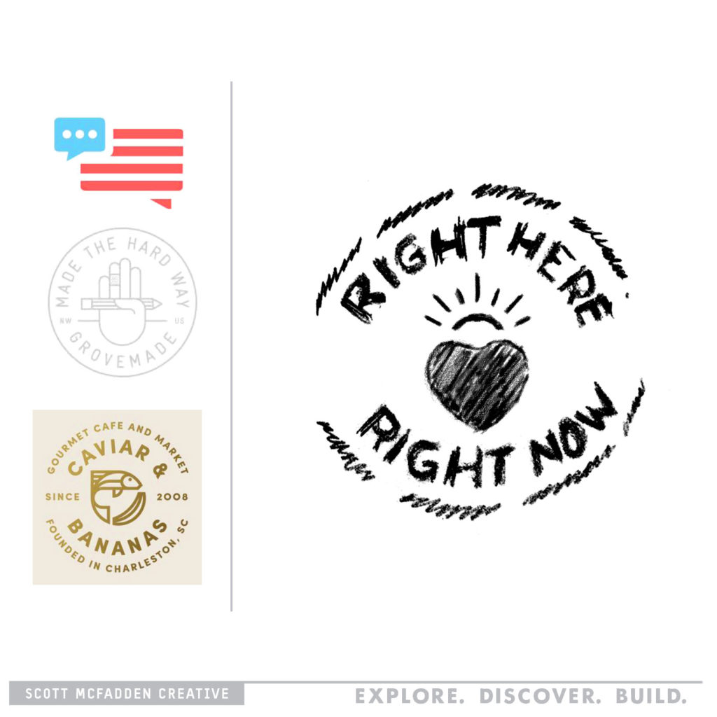
This is where I explore different ideas to solve the findings of the creative brief by using rough pencil sketches and a mood board. Leaving no rock unturned to find the best direction. The mood board is a tool that communicates concepts and visual ideas, I use this as a reference to show the design direction we’ll be heading in. I then create pencil sketches, which allow me to explore more ideas faster, and keep the process centered around the idea and less about the execution.
Phase II: DISCOVER
Comprehensive layouts
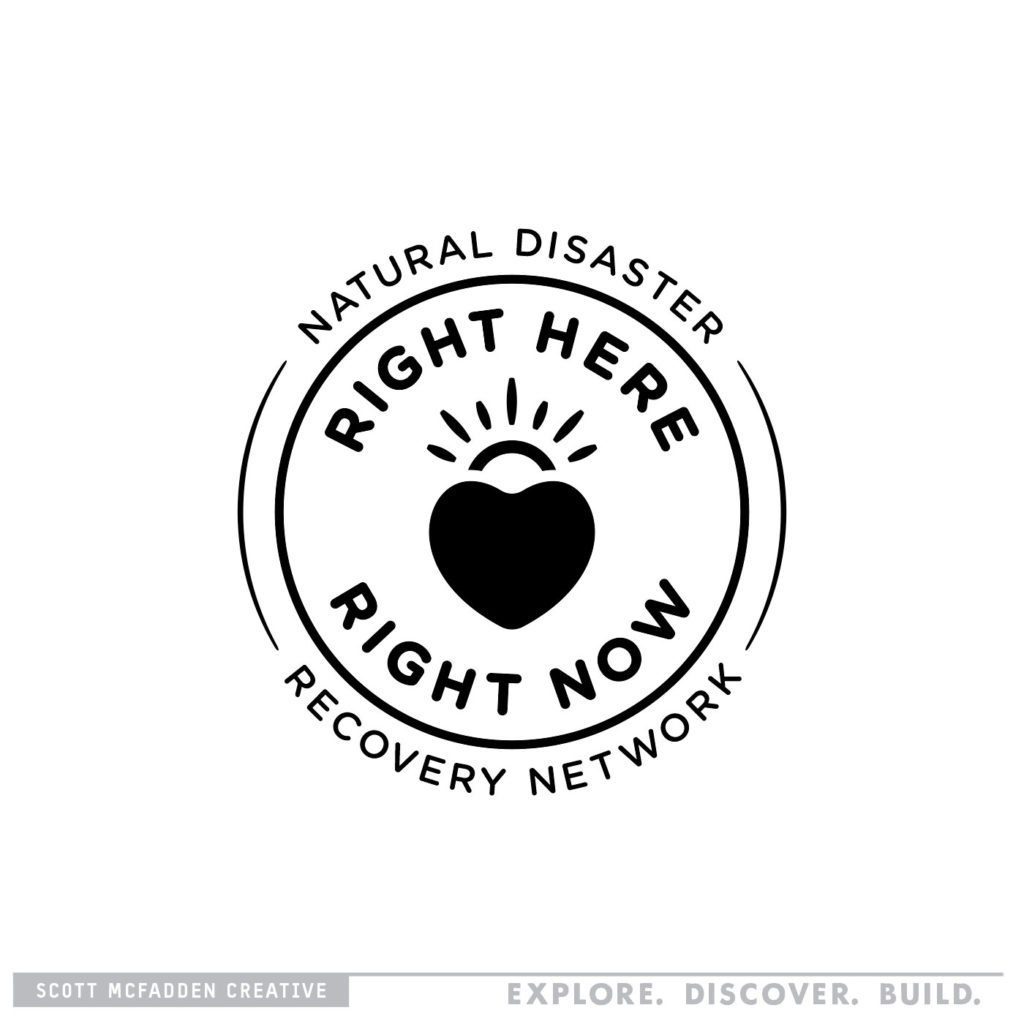
Or “Comps” as we call it in the biz. In Phase II, I will transform the approved concepts and rough designs into comprehensive layouts. This is where you work out all the minutiae and detail of the actual logo construction: is the font Serif or Sans-Serif? What is the stroke weight of the icon? The end result is a draft that is used as a guide for final approval and production.
Black and White vs. Color
I start with a black and white logo to make sure all the elements are clear, and that the logo will be very flexible and work in any situation. For example, we want to make sure it will read correctly on something as big as a billboard or small as a napkin.
Color Treatment:
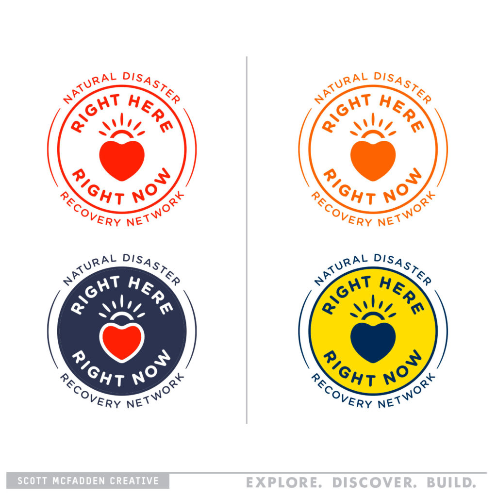
Once the black and white logo is worked out it’s time to add some color. Each color needs to have the right amount of contrast so the logo is readable. A lot of color study goes into this step based on the strategy of the brand. For example, the color palette for a youthful brand might call for saturated, loud energy colors, while muted reserved colors work better for a vintage brand.
Once the final direction is approved by the client, the process will take the comprehensive layouts and move into the next phase.
Phase III: BUILD
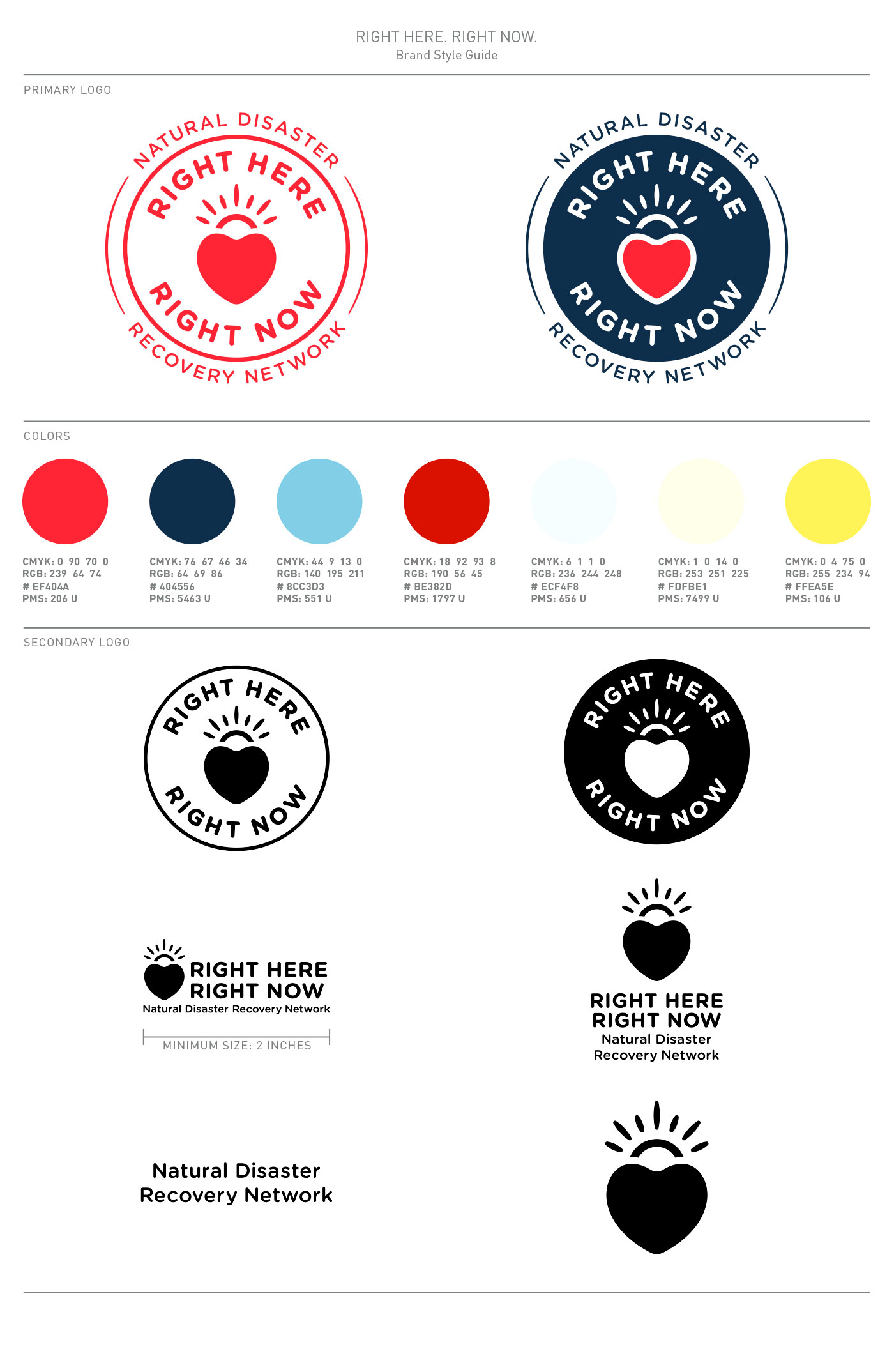
Final Logo Style Guide
This step in the process will prepare the project elements for final delivery to the client in a press-ready format. This includes a style guide and all the production-ready file formats.
With the main logo treatment finalized in Phase II, now is the time to make it work for all possible formatting – for example horizontal, vertical, etc. If the main logo is a circle, will it work on a banner? Taking all these details into consideration, I create versions of the main logo to fit different spec sizes to handle any upcoming situation.
Color Specs
The style guide will include different color formats that are used in the industry and for different situations. Typical color formats are:
- CMYK: for print (like magazine ads) using four inks together to make the print
- RBG: is for computer monitors
- Web Safe: 8-bit color code that can match colors on different monitors
- PANTONE: a color system used by all printers to match colors to match across different mediums
When the style guide is completed the client has the tools and resources they need to get their logo on anything that takes ink and stitching.
In Conclusion
There’s a reason why developing a logo is called a process because we:
EXPLORE all the possible solutions.
DISCOVER the best creative executions.
BUILD the assets the client needs to have a working logo.
There are many processes out there, this is the one that works for me. I am always happy to learn more, if your process is different I would be very interested in hearing that!
