
Castillo Rum Bottles
A while ago, I got to hang out with a good friend of mine in Puerto Rico. Well, not exactly… I just got to work on a packaging label for a Rum product produced in Puerto Rico. This friend happened to be Chris Sendra, a talented creative director who lead a design project that I got to be a part of. Under his direction, we worked on a re-branding packaging label for Castillo Rum. It was quite the journey!
The ‘rum’ down
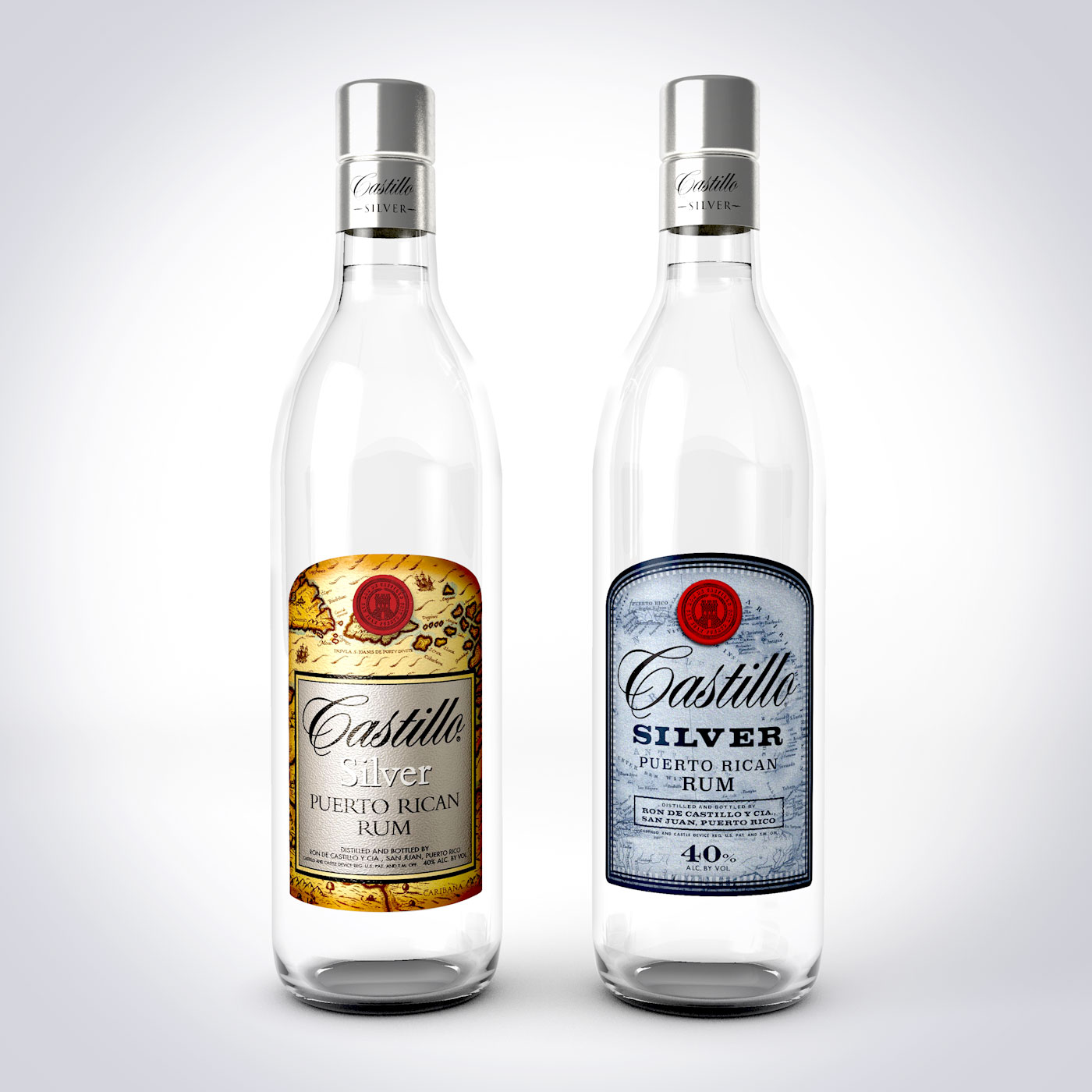
There was a tight deadline since the rum had to be out on the shelves as soon as possible. Where do I sign up? :) The brief had a few restrictions: Keep the original logo, keep the copy points and include a map of Puerto Rico. Projects like redesigning a brand or product label can be tricky. The client wants to “see something new”, but they are also connected to the original branding subconsciously and that makes it difficult for them to let go of the past. On projects like this, I always like to start my design concepts at the low end of the redesign dial (almost the same as the original) and slowly turn it up with new elements, one notch at a time. That way, the client is introduced to something familiar and safe. Then, you slowly open their mind to new discoveries. It also shows you are invested in the brand and interested in helping it expand and evolve in the ever-changing marketplace.
Making the cut
The one good (and bad) thing about a tight deadline is that the revisions have to be made fast and it MUST move forward. Sometimes, this helps get projects like this off the ground instead of being stuck in revision land. Since this deadline was so tight, there were many teams assigned to the project, which made it a nice surprise to hear my design made the cut! They went with the “middle of the road” version which was a huge step forward for the brand!
Showcasing the designs
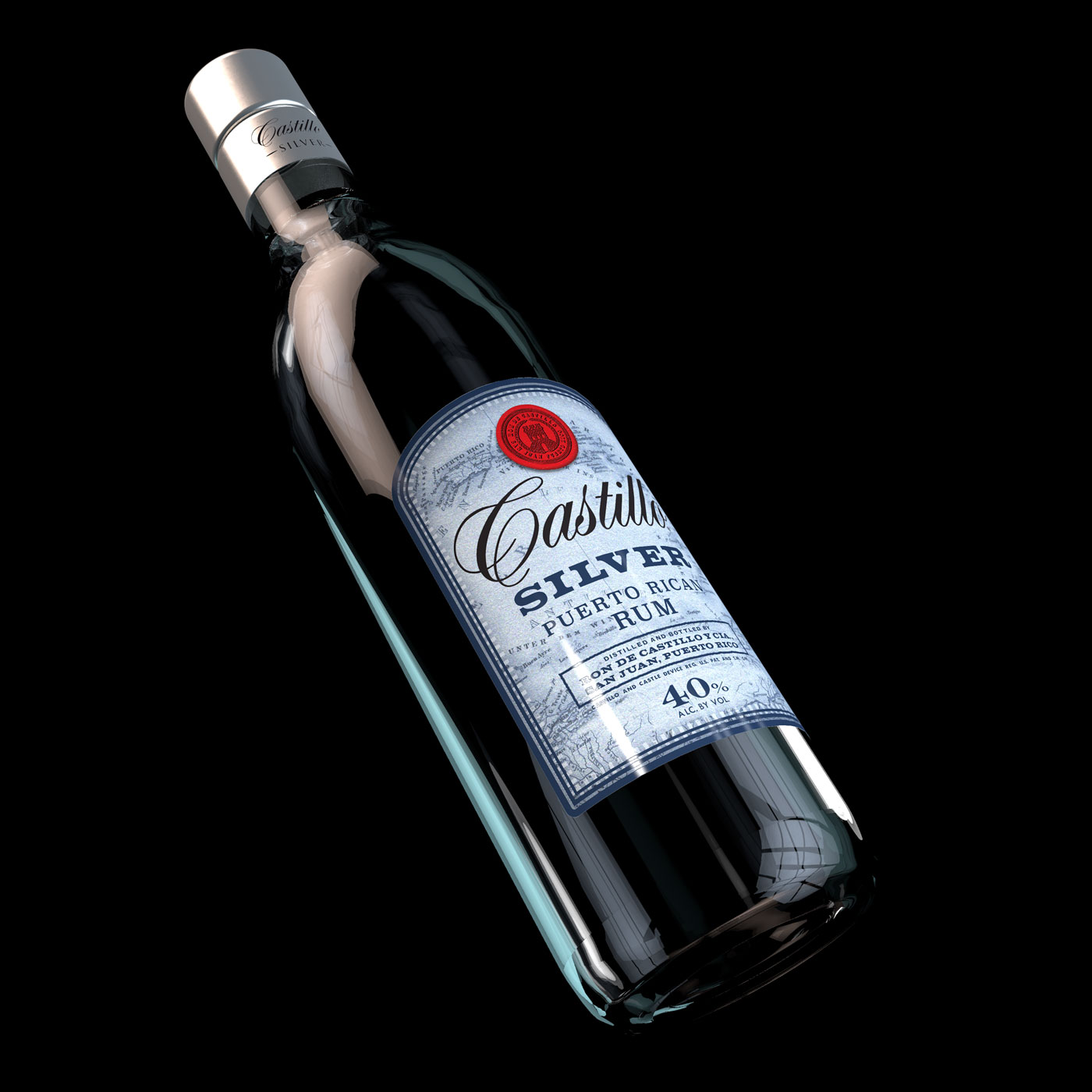
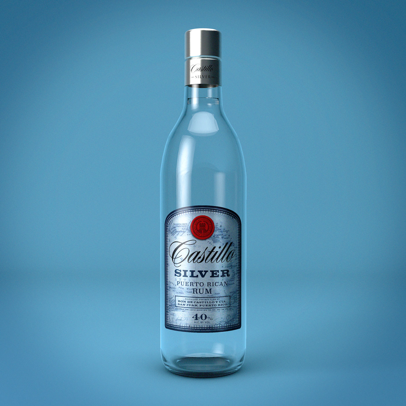
Once produced, I picked up a bottle at the store ( yeah! ) It was so exciting to see it in stores, but then it came time to share my design. I kept putting off shooting since I’m somewhat of an amateur photographer. I don’t have all the expensive gear needed for a full on brand shoot, nor did I want to invest in all the time to get it just right, seeing that I am way too much of a perfectionist. :) So, I decided to recreate the bottle/label in 3D! I challenged myself to match the real version as much as possible. I could use any environment for the background and adjust the angles of the bottle. It gave me much more flexibility to highlight the design in a way that did it justice. I added in some gels to the lighting to bring out the color of the flavored rum as well. The combo shot was especially fun, incorporating all of the vibrant hues and tones together. I could even float the bottle in the air! There were so many great lessons learned in this project and it was able to show off the label in the best light. Now, I am proud to share my work with you!
Below is a before and after shot. I thought the silver color would communicate the clean, high end look associated with Castillo. I feel the updates to the type selection has a turn of the century vibe that resonates with the rich heritage of the Castillo brand giving it a more exotic and adventurous quality.
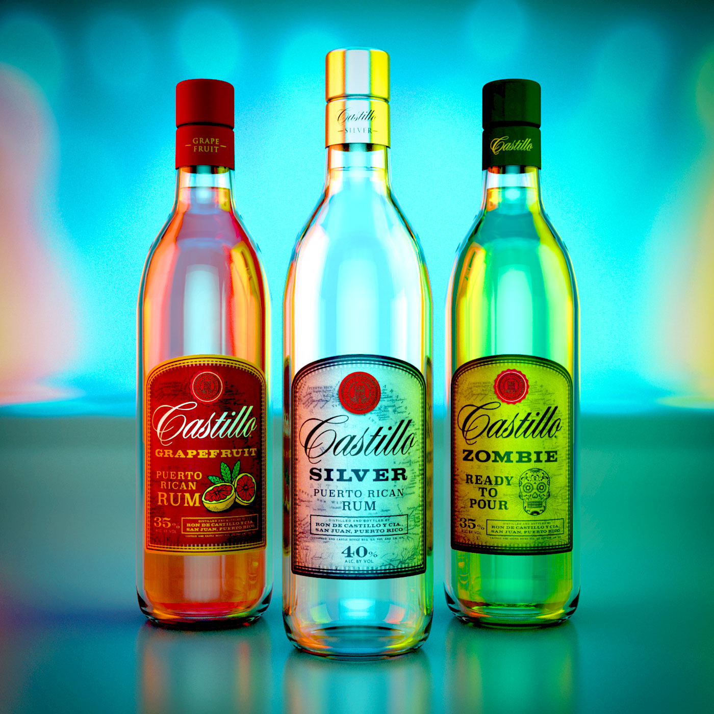
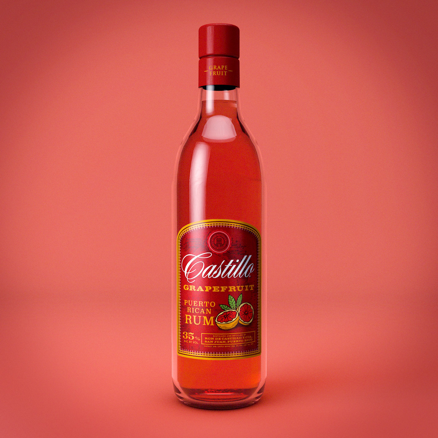
Castillo has a few other flavors including grapefruit. Packaging design offers several puzzles that are always fun to figure out and work around. It was a challenge to work within the brand’s parameters, to stay consistent with the heritage notes and exotic qualities of each label, but then to try and give each unique flavor a slightly different accent to make it stand out. To do this, I tried to keep the type treatment and the image of the map the same and let the color personify the flavor profile. The illustration goes well with the style and allows the subtle flavor cues to shine through.
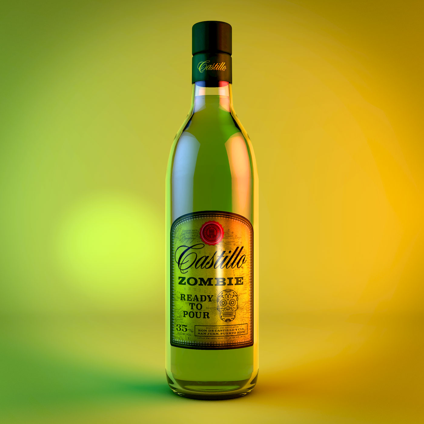
I took a little more liberty on the zombie bottle design, it was just too much fun! I kept the design profile, but made it a bit more distressed and aged to make the flavor concept come alive…or dead…half dead?! Anyways, it just felt right (and good) to bust out the distress brush and mess things up a bit. For the flavor cues, I thought what could be a better profile image than a skull illustration? The actual drink liquid itself is blue, but the green just felt right, right? Its ghoulish look makes it a great holiday treat to celebrate Halloween with. I had a killer time creating this one.
Creative Director: Chris Sendra